

Poster 1
These posters use synergy to promote the band and advertise both their album and tour.

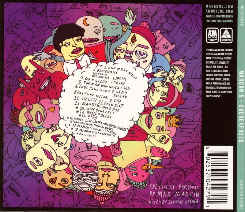
Poster 2
The leading single 'Payphone' featuring rapper Wiz Khalifa was a success and built a hype for the album. Along with the single Maroon 5 have also advertised appropriately. Not only do their posters, which will be put up in music stores and on billboards, aim to boost sales of their album but they also have the agenda of selling tour tickets and advertise online retailers, such as Amazon. This use of synergy is an effective way to get consumers to buy related products to the band, for example tour tickets and merchandise. The beauty of consumers buying merchandise, for example a t-shirt, is that they themselves become advertisers of the band. In poster 2 you can also see that they have also advertised online retailers, for example iTunes, this then gets consumers buying downloads, which is now the modern and fast way to consume music. However focusing more on the album itself now, they have designed the posters to maintain the vibe of the album with the bright colours, busy drawings and cartoon fonts. With an added picture of the band, the posters do not drift from their intention of advertising the album.
Taking away this knowledge of advertising, i will design an advert that will use synergy, maintain the vibe of the song and advertise the album through using a similar design of connecting the two products.
No comments:
Post a Comment